Kaplan-Meier survival estimate
Introduction
This post presents the basic theory of Survival Analysis and provides R code to generate Kaplan-Meier plots. In the world of statistics and data science, understanding survival functions and estimating probabilities becomes crucial, especially when dealing with censored data.
Survival analysis
Survival Analysis Basics
- Survival Function (S(t)): The probability that an event has not occurred by time t.
- Hazard Function (h(t)): The instantaneous rate of failure at time t.
- Survival Time (T): The random variable representing the time until the event.
- Censoring: Occurs when event times for some individuals are not observed by the end of the study.
- Kaplan-Meier Estimator: Non-parametric estimator for estimating the survival function.
- Log-Rank Test: Statistical test to compare survival curves of two or more groups.
- Cox Proportional-Hazards Model: Regression model to assess the effect of covariates on the hazard function.
- Median Survival Time: The time point at which 50% of subjects have experienced the event.
The Kaplan-Meier estimator is used to estimate the survival function from censored data. The survival function S(t) represents the probability that a subject survives beyond time t. The Kaplan-Meier estimator is defined as follows:
Identify all unique event times (times at which events occur) and censoring times. Denote them as \(t_1, t_2, \ldots, t_k\).
The survival probability at the first event time (\(t_1\)) is calculated as:
\[ \hat{S}(t_1) = 1 \]
Since there are no events before \(t_1\), the probability of surviving beyond \(t_1\) is 1.
For each subsequent event time \(t_i\), where \(i > 1\), the survival probability is calculated using the formula:
\[ \hat{S}(t_i) = \hat{S}(t_{i-1}) \times \left(1 - \frac{d_i}{n_i}\right) \]
where:
- \(d_i\) is the number of events at time \(t_i\).
- \(n_i\) is the number of subjects at risk just before time \(t_i\).
If there are censored observations at any time point \(t_i\), adjust the probability as follows:
\[ \hat{S}(t_i) = \hat{S}(t_{i-1}) \times \left(1 - \frac{d_i}{n_i}\right)^{1 - c_i} \]
where \(c_i\) is the number of censored observations at time \(t_i\).
The final survival probability at the last event time (\(t_k\)) is the product of all the individual survival probabilities:
\[ \hat{S}(t_k) = \hat{S}(t_{k-1}) \times \left(1 - \frac{d_k}{n_k}\right)^{1 - c_k} \]
Packages


# Load required libraries
library(survival)
library(tibble)
library(ggplot2)
library(survminer)
The dataset
For this post, we’ll generate a dataset with five variables: patient ID, time to event (survival time), event indicator (whether the event occurred or not), and a binary treatment variable (0 or 1) to represent whether each patient received a particular treatment.
# Set a seed for reproducibility
set.seed(123)

# Number of observations
n <- 100

# Generate an imaginary ID
id <- 1:n

# Generate a covariate (continuous)
covariate <- rnorm(n)

# Generate a binary treatment variable (0 or 1)
treatment <- rbinom(n, size = 1, prob = 0.5)

# Generate survival time (time to event)
time <- rexp(n, rate = ifelse(treatment == 1, 0.08, 0.1))  # Higher rate for Treatment A

# Create event indicator (1=event occurred, 0=censored)
event <- rbinom(n, size = 1, prob = pexp(time, rate = 0.1))

# Map treatment categories to "Treatment A" and "Placebo"
treatment_category <- factor(ifelse(treatment == 1, "Treatment A", "Placebo"), levels = c("Placebo", "Treatment A"))

# Create a data frame
data <- tibble(
  ID = id,
  Time = pmin(time, 10),  # Truncate survival time at 10 units for illustration
  Event = event,
  Covariate = covariate,
  Treatment = treatment_category
)

# Display the first few rows of the dataset
head(data)
Kaplan-Meier Plots
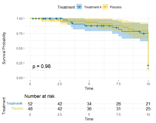
Kaplan-Meier Plot Interpretation
A Kaplan-Meier (KM) plot is a graphical representation of the survival function estimated from time-to-event data. It is particularly useful in scenarios where you have censored data and want to visualize the probability of an event (such as death, relapse, or failure) occurring over time.
X-Axis (Time): The horizontal axis represents time, typically in units like days, months, or years, depending on the study design. It shows the duration of the study or observation period.
Y-Axis (Survival Probability): The vertical axis represents the estimated survival probability. At the beginning of the study, the survival probability is 1.0 (100%), indicating that all subjects are alive or have not experienced the event of interest.
Steps or Drops: The plot consists of a series of steps or drops. Each step represents an event (e.g., death) occurring in the study. The height of the step corresponds to the proportion of subjects surviving at that time point.
Tick Marks: Tick marks on the X-axis indicate censored observations, meaning the event did not occur for those subjects during the study period. Censoring is common in survival analysis when subjects are lost to follow-up or the study ends before an event occurs.
Curves for Different Groups: If you're comparing multiple groups, there will be separate curves for each group on the same plot. Differences in the curves can visually indicate whether there are significant disparities in survival times between the groups.
Median Survival Time: The point on the X-axis where the survival curves cross 0.5 (50% survival probability) represents the median survival time. This is the time at which 50% of the subjects have experienced the event of interest.
Interpretation: As you move along the X-axis, the survival probability decreases, reflecting the increasing likelihood of the event occurring. The steeper the drop in the curve, the faster events are happening in that time period. Differences in curves between groups can suggest different survival experiences.
# Fit Kaplan-Meier survival curve
fit_km <- survfit(Surv(Time, Event) ~ Treatment, data = data)

# Plot Kaplan-Meier curves
g <- ggsurvplot(
  fit_km,
  data = data,
  risk.table = TRUE,
  pval = TRUE,
  conf.int = TRUE,
  ggtheme = theme_minimal(),
  palette = c("#0073C2FF", "#EFC000FF"),  # Blue for Treatment A, Yellow for Placebo
  legend.title = "Treatment",
  legend.labs = c("Treatment A", "Placebo"),
  xlab = "Time",
  ylab = "Survival Probability",
  main = "Kaplan-Meier Survival Curves by Treatment"
)

print(g)

Comparing Survival Curves between Groups
The log-rank test is a statistical method used to compare the survival distributions of two or more groups in a study. It is commonly employed in survival analysis, where the primary outcome is time until a particular event of interest occurs (e.g., death, relapse, failure).
The log-rank test assesses whether there are any significant differences in the survival experiences of different groups over time. It does so by comparing the observed number of events (e.g., deaths) in each group with the number of events that would be expected if the null hypothesis were true, assuming no difference between the groups.
The null hypothesis for the log-rank test is that there is no difference in the survival distributions of the compared groups. If the test yields a p-value below a predetermined significance level (commonly 0.05), it indicates that there is evidence to reject the null hypothesis, suggesting that there are significant differences in survival experiences between the groups.
The log-rank test is a non-parametric test, meaning that it makes no assumptions about the shape of the survival distributions. It is widely used in clinical trials, epidemiology, and other fields where researchers are interested in comparing the time-to-event outcomes between different groups.
# Perform log-rank test
logrank_test <- survdiff(Surv(Time, Event) ~ Treatment, data = data)

# Display the log-rank test results
print(logrank_test)
Call:
survdiff(formula = Surv(Time, Event) ~ Treatment, data = data)

                       N Observed Expected (O-E)^2/E (O-E)^2/V
Treatment=Placebo     52       24     24.1  0.000667   0.00253
Treatment=Treatment A 48       28     27.9  0.000578   0.00253

 Chisq= 0  on 1 degrees of freedom, p= 1
Enjoy Reading This Article?
Here are some more articles you might like to read next: